
In the fast-paced world of digital marketing, a single button can make or break your campaign. That tiny rectangle, commonly known as a Call-to-Action (CTA) button, often decides whether a visitor becomes a customer, a subscriber, or a bounce statistic. But what makes one CTA button effective while another gets ignored? Let’s delve into the science and psychology behind high-performing CTA buttons and uncover the secrets to converting clicks into meaningful actions.
What is a Call-to-Action Button?
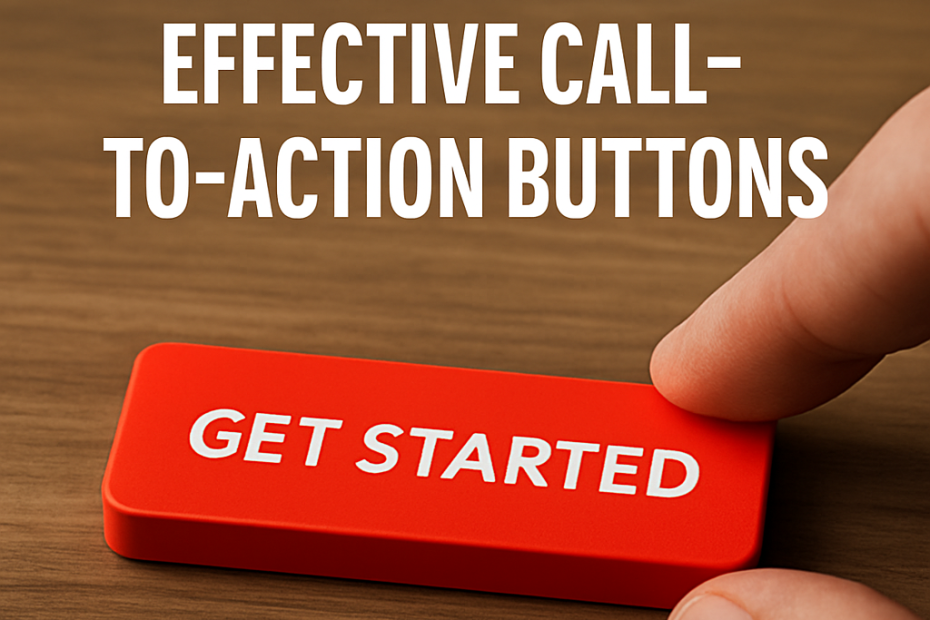
A Call-to-Action button is a prompt on a website, landing page, app, or email that encourages users to perform a specific action. Common examples include:
-
“Buy Now”
-
“Subscribe”
-
“Get Started”
-
“Learn More”
-
“Download Free Guide”
While these may seem like simple commands, there’s a sophisticated blend of design psychology, color theory, behavioral science, and UX principles at play behind every successful CTA.
1. Color Psychology and Visual Hierarchy
The color of a CTA button is one of its most crucial features. According to color psychology, different hues evoke different emotions and responses:
-
Red: Urgency, excitement, danger — great for limited-time offers.
-
Green: Go-ahead, trust, peace — often used in finance or health CTAs.
-
Blue: Security, calm, trust — ideal for SaaS or professional services.
-
Orange & Yellow: Optimism, energy, confidence — eye-catching and high-converting in retail.
A/B testing by HubSpot once showed that a red CTA button outperformed a green one by 21%, even though green was more harmonious with the rest of the site. Why? Contrast and visibility. The red button stood out more. That’s a crucial point: CTAs must visually pop to draw attention.
Key takeaway: Use bold, contrasting colors for CTA buttons, ensuring they stand out from the rest of the page without clashing with your brand.
2. Button Placement and White Space
Where your button appears matters just as much as how it looks. Eye-tracking studies show that users scan web pages in an F-shaped pattern, starting from the top-left corner and moving down in a zigzag.
For optimal impact:
-
Above the fold CTAs (before scrolling) capture users who are ready to act immediately.
-
Below the fold CTAs benefit users who need more context or persuasion.
-
End-of-content CTAs can be effective after blog posts, videos, or tutorials.
White space — the empty area around elements — also enhances visibility. A CTA button surrounded by clutter will be ignored. Give it breathing room to help users focus.
Pro Tip: Some websites use a sticky CTA button that follows the user while they scroll — a subtle reminder without being intrusive.
3. Microcopy Matters: Wording That Converts
The exact words you use on your button play a pivotal role in user response. Buttons like “Submit” or “Click Here” are too generic and offer little context.
Instead, effective CTAs:
-
Use action-oriented language (“Get Your Free Quote”)
-
Promise a benefit (“Start My Free Trial”)
-
Reduce risk (“Try It Free”, “No Credit Card Required”)
-
Personalize the experience (“Send Me Deals” instead of “Subscribe”)
Behavioral studies show that first-person phrasing increases conversion rates. For example, “Start my free trial” may convert better than “Start your free trial” because it feels more personal.
Avoid vague or commitment-heavy terms. Instead of “Buy Now,” consider “Add to Cart” or “Explore Plans” for hesitant buyers.
4. Psychological Triggers: FOMO, Scarcity & Urgency
Behavioral science offers a treasure trove of tools for effective CTA design. Here are a few principles in action:
-
FOMO (Fear of Missing Out): “Limited seats available”, “Only 3 left!” triggers urgency.
-
Scarcity: “Offer expires in 2 hours” or countdown timers on landing pages.
-
Social Proof: Including a mini-statement near the CTA like “Over 1 million downloads” increases trust.
-
Anchoring: Showing a high price crossed out near a CTA for a discounted item sets a price anchor, making the CTA more attractive.
These triggers tap into primal decision-making patterns, helping users justify action quickly and emotionally.
5. Size, Shape, and Responsiveness
Big isn’t always better — but too small is definitely worse. The size of your CTA button should be large enough to notice and tap easily on all devices. Mobile users, especially, benefit from thumb-friendly button sizes.
Shape also influences perception:
-
Rounded corners tend to look friendlier.
-
Rectangular buttons suggest seriousness and formality.
-
Shadows and gradients can give a button a sense of depth and clickability.
And in today’s digital world, responsiveness is mandatory. Buttons must adapt seamlessly to all screen sizes and resolutions.
Hint: Use hover effects and visual feedback (like a slight color change) to confirm interactiveness.
6. A/B Testing and Continuous Optimization
No matter how well a button is designed, testing is essential. What works on one site may flop on another. A/B testing different CTA versions — colors, text, placement, shapes — can yield surprising results.
Use tools like:
-
Google Optimize
-
Optimizely
-
VWO (Visual Website Optimizer)
Monitor metrics such as:
-
Click-through rate (CTR)
-
Conversion rate
-
Bounce rate
Make decisions based on data, not gut instinct.
Final Thoughts
A Call-to-Action button is more than just a clickable rectangle — it’s a critical decision-making touchpoint. When done right, it guides the user smoothly through your funnel, minimizes hesitation, and maximizes conversions.
Remember, the best CTA buttons are:
-
Visually prominent
-
Clear and benefit-driven
-
Emotionally compelling
-
Strategically placed
-
Continuously tested
With a blend of psychology, design, and data, your CTA buttons can transform passive viewers into active participants. In digital marketing, it’s not just about being seen — it’s about getting clicked.
Also, you can learn more about in Through Code startups here.